End To End Mobile Website Design - 2023
Kinjo

Project Summary
Many people are unfamiliar with the neighborhoods of their city when they first decide to move. Our solution is Kinjo, an exciting new website aimed at helping its users find the perfect neighborhood for them. Using a simple and easy-to-take quiz, the site asks users questions that tie back to what they enjoyed and what they’re looking for in a living situation. From their quiz results, the site recommends a neighborhood that would match well with the user!
The Problem
When it comes to finding a new place to live, people feel overwhelmed by the amount of options for locations to move to and are unsure how to decide. After conducting competitive research, I found that there are specific travel websites for showcasing individual locations, as well as sites that are for finding temporary places to live. But there currently isn’t a consolidated site that focuses on presenting potential new locations and their benefits to people planning to move.
The Goal
Design a website that recommends neighborhoods based on a user’s wants and needs.
My Role
Responsible for user research, information architecture, journey flows, wireframing, branding & UI, prototyping
Timeline
8 weeks
Background
Research
Research Objectives
Determine what people look for in a new home when moving
Learn why people move in the first place
Understand the process that people go through when choosing a new place to move to
Discover the reasons why people don’t choose to move to a certain location
Research Goal
I wanted to learn what people look for when choosing a new place to live so that I could present the right options to them in an easy and accessible way.
Methods
Secondary Research
Competitive Analysis
User Interviews
Findings
Secondary Research
Approximately 27 million Americans move each year (Bellhop)
Driving factors for moving (Nexus)
Desire for a better home
To establish a new household
Job related reason
Cheaper housing
Shorten or improve commute
Competitive Analysis
Most existing sites in the marketplace are focused on housing listings and don’t offer neighborhood information
No site has a target market for post-college people looking for a first apartment/home
User Interviews
Interview Participants
All participants were ages 24 - 26
5 participants in total
All participants had moved in the past couple years
Interview Setup
All interviews were conducted remotely via FaceTime
Interviews were one on one
Interviews ranged from 20 to 45 minutes
What were you originally looking for in a new home to move to?
Why did you decide to move to your new home?
How would you make the process of choosing a new home better?
4/5
Participants mentioned affordable cost
4/5
Participants were seeking independence from their parents
3/5
Participants want more accurate online listings
Affinity Map
Themes
Most participants weren’t familiar with the neighborhoods/areas of their city. They were relying on family and friends for suggestions on where to move to.
A big reason for participants moving out was that they yearned for the same independence they experienced in college.
There is a lack of accurate pictures and video tours on sites like Zillow and Apartments.com
How Might We Questions
How might we help young professionals gain a more general knowledge about their city’s specific neighborhoods?
How might we make a city’s neighborhood information more accessible for young professionals?
How might we customize information surrounding neighborhoods that’s relevant to the user?

Problem Statement
Users have a limited neighborhood knowledge of the city that they move to and are struggling to find this information easily online.
Ideate
Sitemap
After identifying my main user problem through research, I was able to start the beginning stages of building out a solution.
This started with creating a sitemap in Figma, which helped me put together how content would be organized on the site.

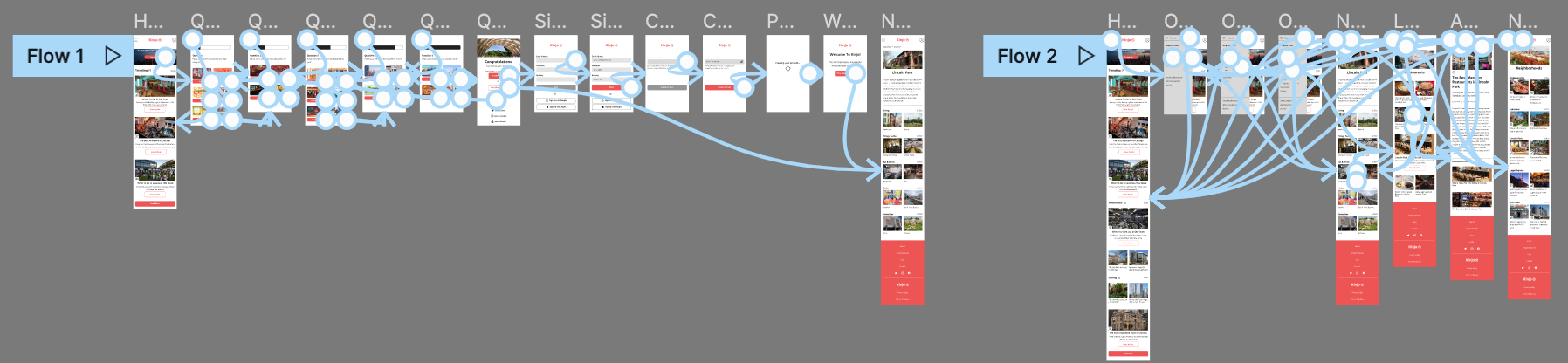
User & Task Flows
With my main content mapped out, I moved into designing how the user would run through certain tasks on the site. The flows were useful, as they helped me determine how many screens should be built out so that the user wouldn’t get burnt out from the site.
The two tasks I mapped out in Figma were:
Finding a specific article
Taking the neighborhood quiz

Sketching Wireframes
The wireframe process started out on paper, where I sketched out the beginning stages of the site. I designed multiple screens with content that I thought was necessary for the site, as well user goals. These sketches would become the building blocks of the site.

Digitizing Wireframes
After sketching out the wireframes, I took the screens to mid-fidelity in Figma, where I could add more detail. I was able to include more elements, buttons, and copy. This helped me see if the design and content layout was working for the site.

Design
Moodboard
When it came time to tackle the site from a UI perspective, the choices for the mood board and visual design came from the brand values.
I thought shades of red were a great depiction of being bold and exciting.

Logo
After testing out multiple logo iterations, I thought the traditional Japanese gate was a perfect representation of the brand.
It represents crossing over into a new area, as well as a new chapter of someone’s life. This also ties into the site’s goal of helping users find the right neighborhood for them.

High Fidelity Wireframes
Using the branding elements that I created, I applied them to the digital wireframes in Figma. This would take them into the highest fidelity and get them ready for user testing.
Prototype
Usability Testing
In order to test out the functionality of the website, I conducted usability testing to see if the task flows could be easily navigated, as well as if the website was user friendly.
Test Participants & Setup
5 participants in total
All tests conducted over Google Meet
Tests ranged from 15 to 25 minutes
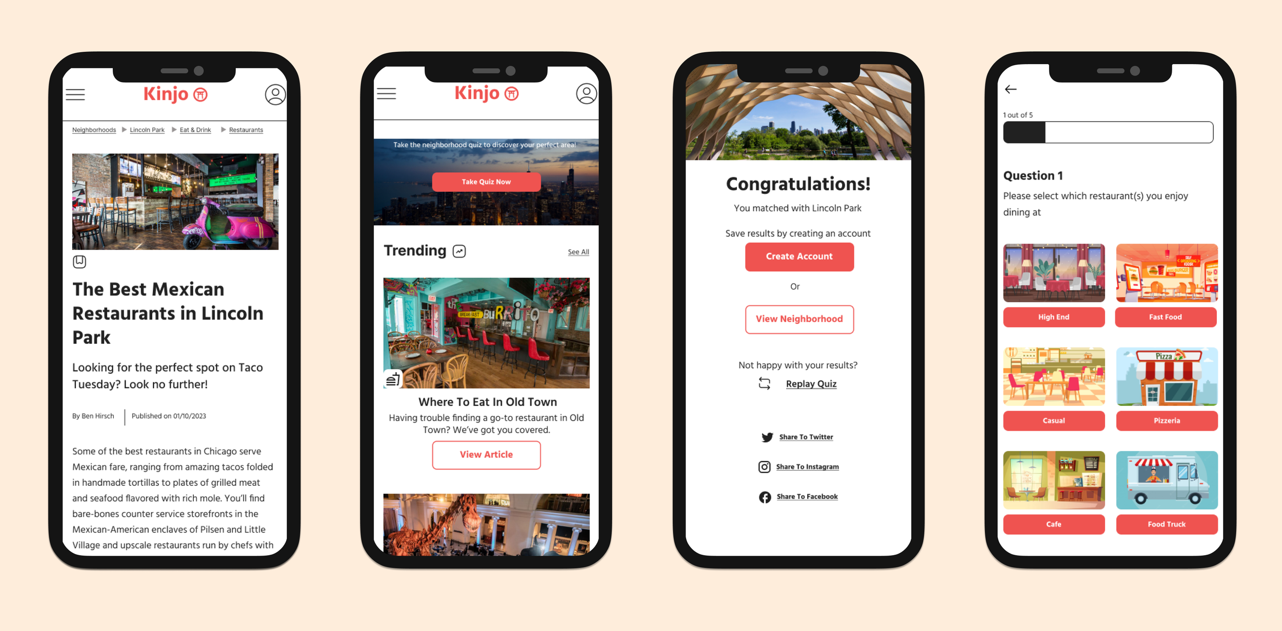
Task Flows
Completing the neighborhood quiz & account creation
Finding the “Best Mexican Restaurants in Lincoln Park” article
Goals
Can the user finish the quiz in under 5 minutes without any errors?
Is the user interested in signing up for an account?
Can the user find the article in 6 minutes or less without any errors?

Usability Testing Affinity Map
After conducting the usability tests, I grouped the findings into an affinity map to analyze what was working and what wasn’t with the website prototype. I also categorized any questions that participants were asking, as well as any ideas for the website they shared.
“I’m a primarily visual person. The graphics for the quiz really made it stand out!”
- Robyn
“I really enjoy the color scheme and logo of the site. It makes it look very clean.”
- Lucas
Usability Test Results
Positive Feedback
5/5
Participants completed the quiz in 5 minutes or less
5/5
Participants selected the “view neighborhood” option at the end of the quiz
5/5
Participants found the specified article in 6 minutes or less
Critical Feedback
0/5
Participants were interested in creating an account
3/5
Participants missed the quiz CTA on the first try
Final Design Iterations
Quiz Results Screen
To incentivize users to create an account, the copy was changed to offer more personalization. As a result of this, the “view neighborhood button was removed so the main option presented to the user would be to create an account.

Home Screen
Since some participants were missing the quiz cta on the first scroll, the banner image was enlarged and the cta was changed to grab users’ attention. A magnifying glass icon was also added to the header so that users can get quick access to the search bar.

Results
Overall, I found that users enjoyed the quiz aspect of the site and the personalization that it offered. A clean and simple site layout is much better than trying to cram in as many features as possible.
For future iterations of the site, I’d like to test out including more neighborhoods on the site, or even expanding to multiple cities with the addition of geolocation. It would also be interesting to test out different versions of the menu, as some participants pointed out that having the neighborhoods available on the home page would make for easy navigation.
When looking to the next steps, I’d be interested in testing out the site with a larger group of people. This can help gauge if the product is ready to be shipped out to the public.