My Role
End To End Application - 2023
The Museum of Science & Industry
User research, information architecture, journey flows, wireframing, branding, prototyping
Tools
Figma, Maze, Google Sheets
Timeline
80 Hours
Background
Project Summary
The Museum of Science & Industry is a science museum located in Chicago’s Hyde Park neighborhood and is one of the biggest museums in the city. It features a variety of exhibits ranging from physics to biology.
Since the MSI didn’t have its own app, there was an opportunity to design something that could greatly benefit Chicago museum visitors. The result was an app that brought all of the wonder and learning of the MSI into a digital experience. The main feature of the app was an immersive augmented reality feature that would bring the exhibits to life right in the user’s home.
The Problem
Museum-goers love taking the trip to see their favorite exhibits and even want to learn after visiting. However, rising ticket prices and large crowds were negatively impacting their experience. How might we bring the museum experience into the comfort of one’s home?
Goals
Design an end-to-end application for the Museum of Science & Industry that can replicate the experience of visiting the museum.
Design a feature that can immerse the user into the world of the exhibit.
Research
Research Goal
I am interested in exploring the underlying motivations behind individual’s appreciation for museums
Research Objectives
Learn why people like going to museums
Learn which types of exhibits people enjoy seeing at museums
Determine in which scenarios people visit museums
Determine the main demographic of museum-goers
Methods
Secondary Research
Competitive Analysis
User Interviews
Findings
Secondary Research
Museum admission fees for non-Chicago residents increase by $4 (ABC)
60% of museums report experiencing pandemic-related financial losses since March 2020 (AAM)
Museum attendance recovery has slowed, with some cultural institutions finding that audience levels have stagnated or dropped over the last year (Artnet)
The Museum of Science & Industry’s circus exhibit has closed after 50 historic years (NBC)
Competitive Analysis
The market for museum apps seemed to center around being a companion for when users are at the museum
There was an opportunity for an app that could give users a museum experience without having to go
Museum Applications
User Interviews
Interview Participants
All participants were ages 27- 34
5 participants in total
All participants had been to a museum before
How often do you continue learning after your museum visit?
4/5
Participants said they like to continue learning about a favorite exhibit
Interview Setup
All interviews were conducted over Google Meet
Interviews were one on one
Interviews ranged from 15 to 35 minutes
What do you enjoy about museums?
3/5
Participants noted that they enjoy the innovative and interactive exhibits
What do you dislike about museums?
3/5
Participants noted that large crowds were a negative factor for their visit
“It (the museum) was really crowded and a bit overwhelming. I think this caused me to stay less than I normally would” - Arielle
Affinity Map
Themes
Museum-goers are hungry for learning and will take the opportunity to explore museum topics even after their visit
Crowded exhibits and rising ticket prices can negatively impact a person’s museum experience
Persona
Using the interview answers as a guide, I created a user persona for my target audience. Knowing who I would be designing the app for would help me make smarter design decisions
The persona became Mindy, the inquisitive explorer. Mindy enjoys going to the museum to learn something new. However, she doesn’t like the large crowds.

How Might We Questions
How might we translate museum exhibits into a mobile experience?
How might we bring the museum experience into the digital realm?
How might we make museum exhibit information more accessible for museum visitors?
How might we showcase museum exhibit information in an interesting manner?
The Solution
After analyzing my research results and seeing the problems of crowded exhibits and high ticket prices, I idealized that the best solution was an app for The Museum of Science & Industry that could replicate a visit to the museum.
I thought the best way to truly bring users into the museum virtually was with an augmented-reality feature.
Ideate
Feature Roadmap
The first step in designing the app was deciding which features were going to be included. I sorted them by 4 tiers of importance, prioritizing the AR feature first.
For the other features, I looked at the competitor apps to see what else users were interested in.
Sitemap
When developing the sitemap, I based the structure around the core augmented reality feature. I placed the exhibits page in the center of the navigation bar, so the users eyes would be immediately drawn to it. After that, I established the secondary features, including the user profile, home page, and about page.
User & Task Flows
Using the sitemap, I designed two journey flows that would help me see how users would be moving through the app. I wanted users to be able to test out the main focus of the app, the augmented reality feature. In addition, I was interested in seeing how users would accomplish saving an exhibit they like to their profile.
Testing out the AR feature for the Pompeii exhibit
Saving the Science Storms exhibit to the “My Exhibits” page
Digitizing Wireframes
Using my wireframe sketches, I took my screens into mid-fidelity and brought them into Figma. Here I could figure out placement, sizing, and overall a better sense of how the app would be looking.
The first section of the home page lets the user know about the central AR feature
The search page is a pop-up modal that appears from the bottom of the screen
Cards for each exhibit contain an image, title, and short description
Clicking the heart icon will save the exhibit to the My Exhibits page
The My Exhibits page can be accessed through the Profile page
The AR feature button is prominent on the exhibit page so users can easily access it
Sketching Wireframes
After shaping the core features of the app with the sitemap and journey flows, I sketched out wireframes for what it would look like. These screens included the home, profile, and exhibit page, as well as the AR feature.
Testing out the AR feature for the Pompeii exhibit
Saving the Science Storms exhibit to the “My Exhibits” page
Design
Branding
When it came time to choose a color palette and font choice, I decided to keep the branding and UI of the museum’s website so it would be familiar to current museum-goers.
Current Website

UI Component Kit
Using the branding guidelines I created, I designed the components that would become part of the high-fidelity wireframes. The component kit was made up of:
Navigation Bar
Augmented Reality Button
Exhibit Card
Event Card
Filter
Page Headers
Add Button
Information Cards

Contextual Research
In order to bring the augmented reality feature to life, I took a trip to the Museum of Science & Industry for contextual research. While at the museum, I was able to experience the Pompeii exhibit firsthand and take pictures of all the artifacts. I took pictures from multiple viewpoints which is what helped me mock up the feature.
Along with taking pictures, learning about Pompeii helped me fully realize the exhibit page of the app and make it as accurate as possible.
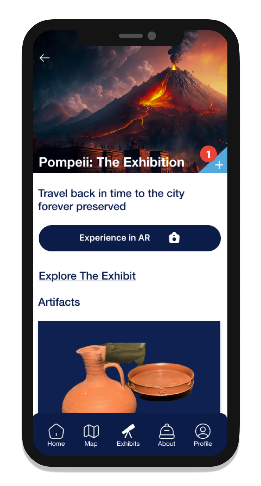
High-Fidelity Wireframes
For the final wireframe fidelity, I applied the branding, UI, and museum assets to my designs. The primary blue color was used for the navigation bar and headers, while the lighter blue was used for the buttons.
My museum pictures were implemented in the exhibit pages and the AR feature. For augmented reality, I took pictures of multiple angles in my apartment and placed the corresponding artifact pictures within them.
1. A cover picture of the museum lets the user know what the app is meant to be
2. I redesigned the exhibit cards to be more reminiscent of the UI already present on the website
3. The add button was changed from a heart to a plus icon to make it more clear to the user what its function is
4. Using the camera and augmented reality functionality, artifacts are brought into the user’s camera screen
5. Clicking the arrows will turn the artifact, giving the user a 360-degree view
6. Selecting a different artifact icon will bring a new one into view
Prototype
Usability Testing
Test Participants & Setup
6 participants in total
All tests conducted over Maze
Tests ranged from 15 to 30 minutes
Usability Testing Affinity Map
Task Flows
Testing the AR Feature
Saving an exhibit to the My Exhibits page
Goals
Can the user save the exhibit without encountering any errors?
Can the user find the AR feature without encountering any errors?
Can the user successfully navigate the app?
“Getting to the AR CTA was straightforward and easy to navigate to” - Kat
Usability Test Results
Positive Feedback
5/6
Participants completed the AR task without any errors
4.5s
The average time spent on each screen
3/6
Participants thought the AR tile on the home screen was clickable
Critical Feedback
Final Design Iterations
“I knew I had to check my profile and see all the exhibit options saved” - Yvonne
Home screen
Participants thought that the tile explaining the AR feature was clickable and would take them to an exhibit. To fix this, I:
Switched out the tile with cards for the exhibits that had AR capability. Clicking on them would take users to the exhibit
The cards operate on a carousel, where users can scroll through each exhibit
Pompeii screen
Participants noted that they thought the “add exhibit” button was hidden. To fix this, I:
Moved the button to the lower right corner of the cover picture so it would be more visible to users


Exhibits screen
Participants were having trouble finding the Science Storms exhibit, specifically because the category was unclear. To fix this, I:
Renamed the exhibit category from “Energy” to “Environmental Science”. These categories can be found on the museum’s website
Swapped out the Coal Mine exhibit for the Extreme Ice exhibit as the cover tile
AR Instruction screen
Some participants were unfamiliar with how to work the AR feature. To fix this, I:
Added an instructional screen before the feature loads explaining how to navigate it
The arrows are highlighted to show what the instructional card is referring to
3/6
Participants had trouble locating the Science Storms Exhibit
Results
After completing my final designs, I believe that The Museum of Science & Industry app will be incredibly beneficial and educational for museum-goers who want to experience the MSI’s exhibits within their own home. Incorporating new technology like augmented reality is something I think differentiates this app from various competitive ed-tech apps.
For future design iterations, I would be interested in testing out the AR feature with other exhibits and how that would look. I would also like to give users more time to fully explore the app and all of its features.