My Role
Responsive Website Redesign - 2023
The Wormhole Coffee Shop
User research, information architecture, journey flows, wireframing, branding, prototyping
Tools
Figma, Google Sheets
Timeline
80 Hours
Background
Project Summary
The Wormhole is a local Chicago coffee shop, located in the Wicker Park neighborhood. The shop is decked out in an 80s theme, which includes memorabilia, specialty drinks, and even a full-sized DeLorean. Many loyal customers love coming to the shop for locally sourced-coffee.
To help boost the shop’s revenue stream, as well as the customer experience, I redesigned their existing website. Along with the new site, I also implemented an online ordering feature that would add convenience to the target audience of busy professionals.
The Problem
The Wormhole needed a way to stand out and compete with chain shops like Starbucks and Dunkin Donuts. Along with this, the usability audit I conducted revealed that users were having trouble identifying what the site was for at first glance. How can we make The Wormhole stand out from other coffee shops?
Goals
Redesign the current site for The Wormhole to showcase the shop’s story and brand to the user
Integrate a new feature/element that will provide convenience to the target persona, as well as an additional revenue stream for the shop.
Research
Research Goal
I wanted to learn what customers value about The Wormhole so that we can offer more and differentiate the businesses revenue streams.
Research Objectives
Learn why people favor their favorite coffee shop over other cafes
Determine in which scenarios people go for coffee
Understand the main demographic of coffee shop customers
Learn if coffee consumers ever purchase products online
Understand what different revenue streams independent coffee shops have
Methods
Secondary Research
Competitive Analysis
Heuristic Evaluation
User Interviews
Findings
Secondary Research
Over one-third of people aged 18-29 report having recently visited a coffee shop (Toast)
Online ordering is still popular. The pandemic accelerated the adoption of online ordering technology in independent cafes (Toast)
Cafes are investing in technology automation (Toast)
In the first 5 years in business, more than half of independent coffee shops will close. 99% of small coffee shop closures have nothing to do with the quality of their coffee (Coffee Affection)
Gourmet coffee makes up 59% of the coffee consumed on a daily basis (Coffee Affection)
Competitive Analysis
Almost all of the competitors have an online ordering feature
All competitor sites contain ‘about us” sections that highlight to the user what is unique about the shop
Local Coffee Shops
Chain Coffee Shops
Heuristic Evaluation
To better understand the problems with the current site, I conducted a heuristic evaluation to see what was missing and what wasn’t working well.

User Interviews
Interview Participants
All participants were ages 25 - 26
4 participants in total
Participants varied in coffee consumption from twice a week to daily
Where do you typically go for coffee?
4/4
Participants noted that Starbucks is their go-to coffee shop
4/4
Participants were confused with the blog posts on the home screen
Interview Setup
All interviews were conducted over FaceTime
Interviews were one on one
Interviews ranged from 15 to 35 minutes
How do you typically choose a new cofee shop?
3/4
Participants said they usually try coffee shops that are within walking distance
3/4
Participants noted the lack of store imagery on the site
In which scenarios do you drink coffee?
3/4
Participants said they pick up coffee on their way to work
“I go to Starbucks, not because it’s especially good. It’s the closest to my apartment” - Adam
Usability Audit
Following the interview questions, I pulled up The Wormhole website and asked participants to give me their honest thoughts on it. This would give me some insight into what isn’t working for the current site.
3/4
Participants noted that there wasn’t a menu on the site
“The first thing that stood out to me is that I wasn’t sure it even was a site for a coffee shop” - Brendon

Affinity Map
Themes
Starbucks is the most popular coffee shop among participants, primarily due to convenience
People like to go to local coffee shops for the atmosphere and good food
Most participants were confused with the blog page and why the site opened on it
Persona
After conducting user interviews, I put together a persona for the target audience that The Wormhole will be after. I modeled the persona around the central theme of the interviews, which was seeking convenience when purchasing coffee.
The persona became Emily, the casual coffee drinker. Emily goes to the Starbucks around the block every day for her morning cup of coffee. On the weekends she enjoys going to her local coffee shop to read and work.

How Might We Questions
How might we improve the ordering process for The Wormhole?
How might we shorten the wait time for coffee at The Wormhole?
How might we prioritize customer convenience for The Wormhole?
How might we showcase The Wormhole’s coffee and food options to busy professionals?
The Solution
To solve the convenience problem surrounding local coffee shops, my proposed solution was an online ordering feature for The Wormhole website. This would help bring in an additional revenue stream to the shop, as well as help busy professionals with ordering coffee in the morning.
Ideate
Sitemap
After conducting the usability audit, I modeled the new sitemap around what users were finding helpful and also what they didn’t like. I moved the blog posts off the home screen and to their own page, as to not confuse users. I also eliminated all third party links except for one, since they all led to the same site.
To incorporate the new features into the site, I added “order now” and “profile” pages to the main navigation menu.

Updated Sitemap
User & Task Flows
In order to map out the new online ordering and profile feature, I created two sets of journey flows that would help me see what screens would be necessary for my upcoming wireframes. These were:
Creating an account & adding a preferred payment method
Placing an online order
Digitizing Wireframes
I translated my wireframe sketches into Figma where they could be more fully realized and I could get a better indication of placement and size.
The “order now” button remains sticky and at the bottom of the screen to grab a user’s attention
Items are grouped into cards for better organization
A quick-add modal for faster ordering when a user doesn’t want to click into an item
The item screen gives a user more customization options for their beverage or food item
The checkout screen is a pop-up modal to eliminate having to click into another page
A user can enter their credit card information for faster checkout
Sketching Wireframes
Following the journey flows, I translated the steps into wireframe sketches. These would be the building blocks of the website. The sketches included the home, menu, and item screen.
Desktop
Mobile
Tablet


Placing an order online
Account creation & adding a payment method
Design
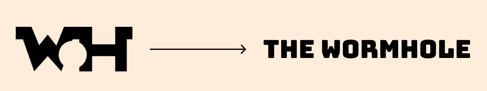
Logo Redesign
The existing logo for the site was the initials ‘W’ and ‘H’ for The Wormhole. I decided to redesign the logo, as new users most likely wouldn’t recognize the name of the shop based solely on initials.
During the redesign process, I decided to go with a wordmark, so new users/customers would be able to know what the name of the shop is. To go along with the retro 80’s theme of the shop, I ended up going with the font bungee, as I thought it was the most readable and was simple enough to recognize.
High-Fidelity Wireframes
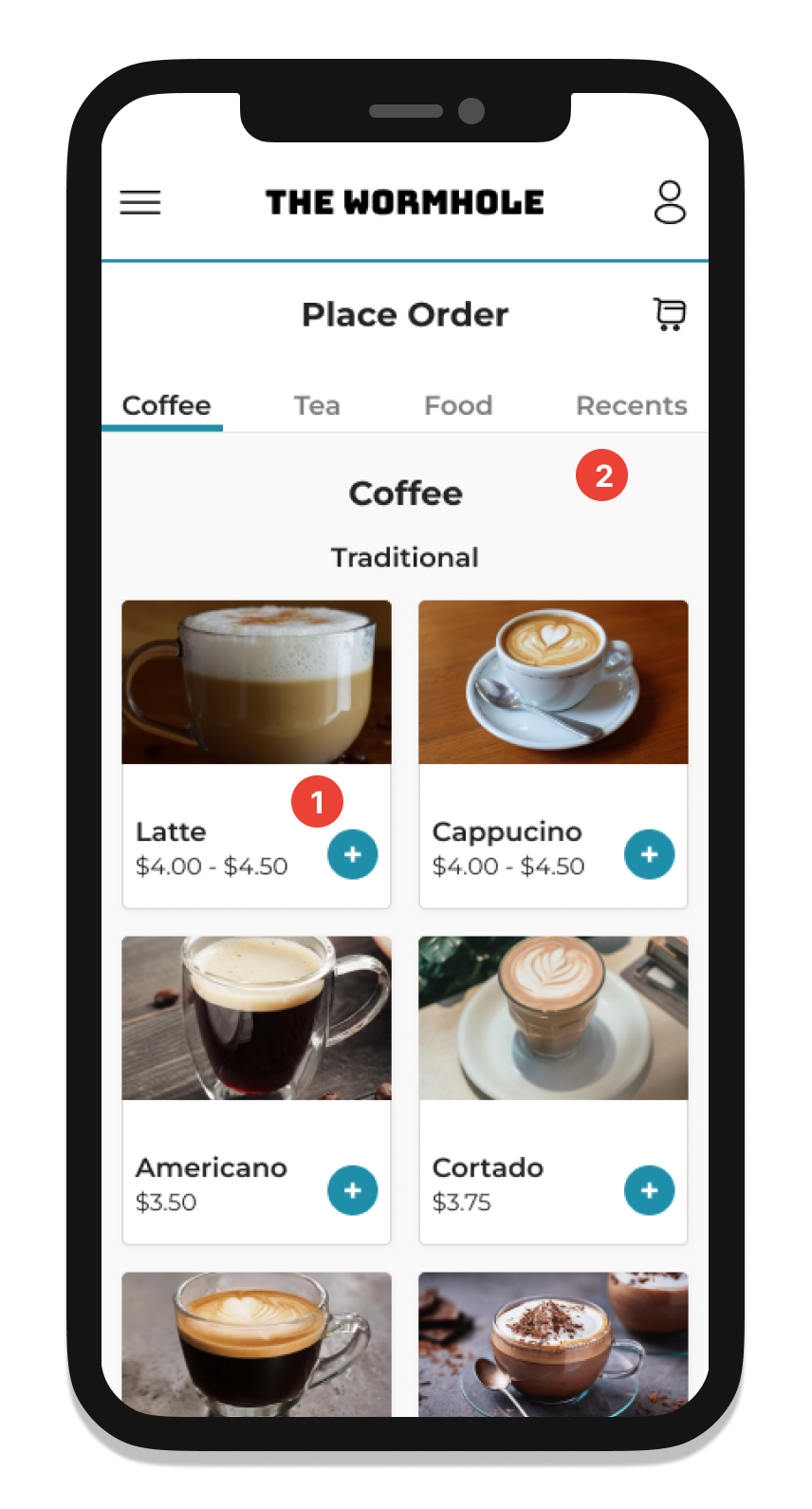
After completing the logo redesign, I took my designs from mid to high fidelity. For the menu and item screens, I added pictures of the beverages and food items. For the buttons, I added a light blue coloring which was already present on the current site and which I decided to keep as it worked well with the new designs.
1. A photo of the shop was added to give users a good sense of what The Wormhole is
2. I changed the tab menu so the unused sections are greyed out, making it more apparent to the user
3. I added an exit button to the quick-add modal to let the user know they can return to the menu screen
4. I added a drop shadow to the “add to order button” to make it pop off the screen more
5. An order confirmation pop-up after the checkout screen helps let the user know that their order went through
6. When a user successfully enters a credit card, it will appear like this under the payment section
Prototype
Usability Testing
Test Participants & Setup
5 participants in total
All tests conducted over FaceTime
Tests ranged from 15 to 30 minutes
Usability Testing Affinity Map
Task Flows
Account creation & adding a payment method
Placing an online order
Goals
Can the user successfully place an order without any errors?
Will the user recognize when an item is in their cart?
Can the user successfully create an account and add a payment method without any errors?
“It’s very familiar to how I would use a coffee ordering site” - Sona
Usability Test Results
Positive Feedback
5/5
Participants used the quick-add button to place an item in the cart
5/5
Participants completed the tasks without any errors
3/5
Participants noted the order confirmation pop-up was vague
Critical Feedback
Final Design Iterations
“The site has a good ratio of pictures to text and looks very clean” - Tyler
Menu screen
Participants noted that there was a lot of white space on the menu screen. In order to make the screen look less like a wireframe, I:
Redesigned the menu cards to have the item pictures take over the top half. I also added color to the quick-add button
Changed the background to a light grey so that the cards would pop off the page
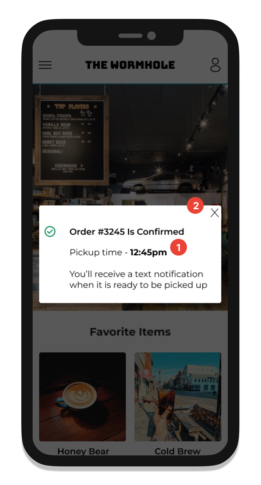
Order Confirmation screen
Participants pointed out that the order confirmation pop-up didn’t provide a lot of details and wasn’t seen at first glance
I added the pickup time to the order confirmation to remind users when their items will be ready
I turned the pop-up into a modal that sits above the home screen so it can’t be missed
5/5
Participants clicked the profile icon to create an account
2/5
Participants pointed out the abundance of white space on the menu screen
Responsive Design
Tablet
When translating my mobile designs to tablet size, I Increased the number of menu items in a row to three and resized the images on the home screen. I was also able to insert the full menu, instead of having it hidden under the hamburger button
Desktop
Since the desktop size is a little bigger than a tablet, I bumped up the number of menu items in a row to four.
Results
In summary, I think that my redesign of The Wormhole site, as well as the addition of the online ordering feature can greatly improve the business end of the shop, as well as the overall user experience. For working professionals, they will be able to efficiently order their morning coffee before work and get a good sense of what the shop is all about from the newly designed home page.
For future design iterations, I would take the opportunity to test the site out with real customers of the coffee shop. This could give me a good sense of what items people are ordering and if the menu should be restructured.